Excel dashboard template for small business: free download
Free Excel template, no sign-up: sales, margin, cash and budget on one page. How to build a management dashboard in Excel and keep it up to date.
Free Excel template
A small-business management dashboard, ready to fill in
A workbook with no macros and no sign-up form: paste your sales, enter your budget, and the dashboard page updates.
- One dashboard page: revenue, gross margin, estimated EBITDA, cash and days sales outstanding
- Variances against budget and last year, with a status written in words: OK, Watch, Alert
- 4 charts, top 5 customers, revenue by product family and automatically written watch points
- Step-by-step instructions, including importing your exports with Power Query
.xlsx file, 115 KB, no macros. No email address required.
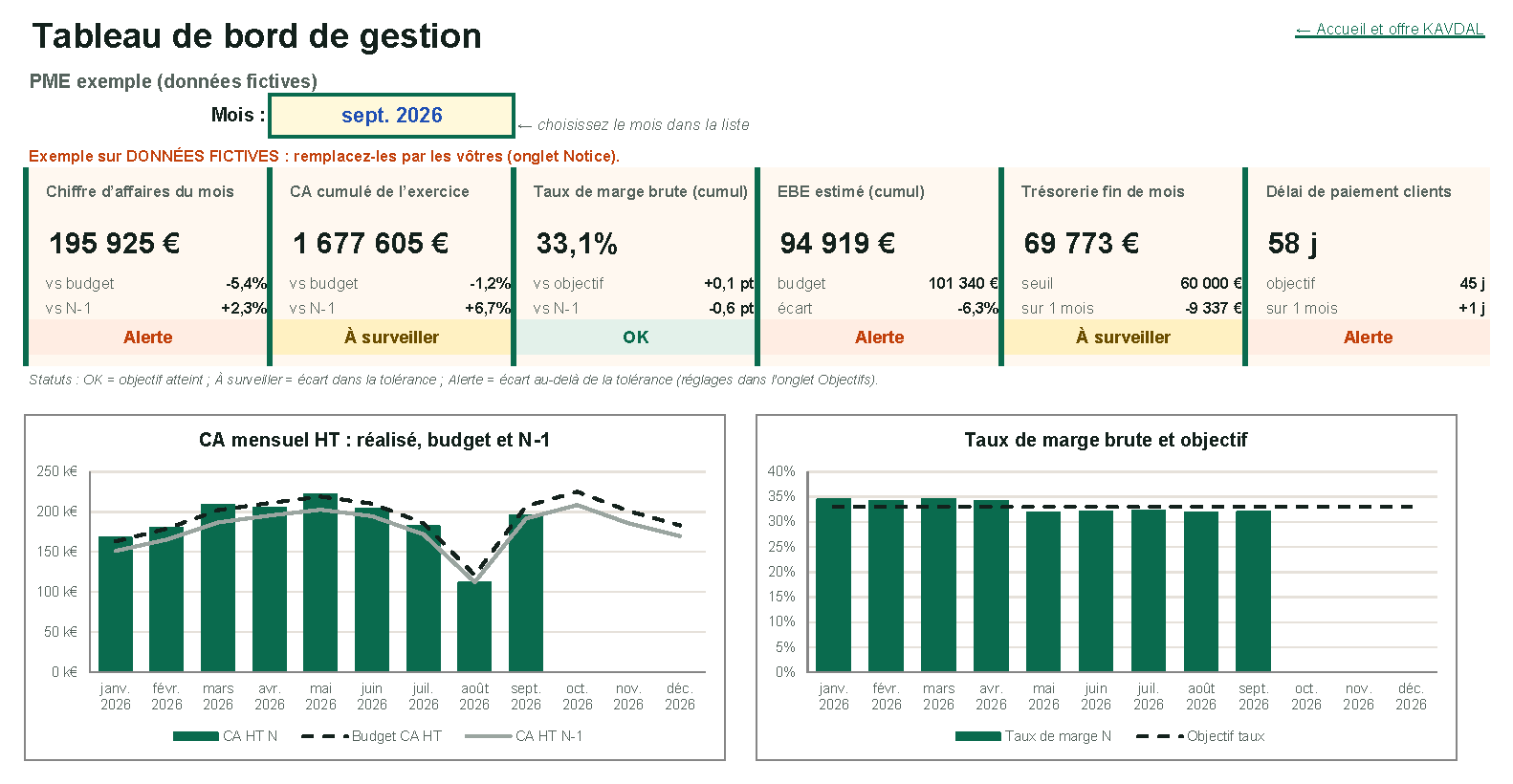
A useful Excel dashboard for a small business fits on one page. It answers three questions: where do I stand against budget, is it better than last year, and what needs my attention this month. The template above does exactly that, on fictional data you replace with your own. The rest of this article explains how it is built, so you can adapt it or build your own.
The Excel dashboard template: what it includes, and what it doesn’t
The file is a standard Excel workbook (.xlsx), with no macros, no external connections and no form to fill in before downloading. It is in French, opens on a welcome page, and then has these tabs:
| Tab | Purpose | What you do there |
|---|---|---|
| Tableau de bord (dashboard) | The management page | Pick the month from the list, read |
| Données ventes (sales data) | The export from your invoicing software | Paste your rows (date, customer, product family, revenue, purchase cost) |
| Données mensuelles (monthly data) | Fixed costs, bank balance, customer receivables | Enter 3 figures a month |
| Objectifs (targets) | Monthly budget, margin target, alert thresholds | Set once a year |
| Listes (lists) | Customers and product families | Add new ones |
| Calculs (calculations) | All the formulas | Nothing: leave as is |
| Notice (instructions) | How to use it | Read once |
The dashboard page shows six indicators: monthly revenue, year-to-date revenue, gross margin rate, estimated EBITDA, month-end cash and days sales outstanding. Each one is compared with the budget or last year, with a status written in words (OK, Watch, Alert) rather than a colour alone. Below them: four charts across the year, the top five customers, revenue by product family, and summary sentences written by the formulas, such as “Days sales outstanding at 58, against a target of 45”.
What it doesn’t do, to be clear: it doesn’t fetch your numbers on its own. Every month, you paste the sales export and enter three amounts. It is quick if your exports are clean, slower if they need fixing. We come back to this at the end.
The 3 types of dashboards, and which one to build in Excel
Dashboards are usually grouped into three types, depending on who reads them and how far ahead the decisions go:
- The strategic dashboard, for the leadership team and shareholders: a few indicators over the year, profitability, growth, financial strength. It is reviewed every quarter.
- The management dashboard, for the owner of a small business: the current month against budget and last year, margin, cash, customers. It is reviewed every month, sometimes every week.
- The operational dashboard, for a team: today’s orders, late deliveries, production. It is reviewed every day, and its data changes too fast for manual updates.
Excel suits the second type very well: a monthly rhythm, around ten indicators, data from two or three exports. That is what the template provides. An operational dashboard needs data refreshed automatically, so a tool connected to your software.
The management indicators to put on the page
A good owner’s dashboard in Excel has six to eight indicators, no more. The template covers the four basic questions: are we selling enough, are we making money, can we pay, will it last.
| Indicator | Calculation in the template | What it flags |
|---|---|---|
| Monthly and year-to-date revenue | Sum of revenue excluding VAT for the period | A shortfall against budget before the year-end close |
| Gross margin rate | (Revenue − purchase cost) ÷ revenue | A supplier price rise that was not passed on |
| Estimated EBITDA | Gross margin − fixed costs | What is left to invest and repay |
| Month-end cash | Bank balance entered | Tension before it becomes an overdraft |
| Days sales outstanding | Receivables incl. VAT ÷ revenue incl. VAT over 3 months × 90 days | Customers paying later and later |
| Top 5 customers and revenue by family | Sums by customer and by family | A dependency, or a product losing ground |
The right choice depends on your sector: a distributor watches stock turnover, a services firm its billable rate. The dashboard indicator generator by sector gives you the eight to track, with their formula and how to set the threshold.
How to create a dashboard in Excel, step by step
1. Start from the decision, not the data
Before opening Excel, write down the three or four decisions the dashboard must support: chasing a customer, renegotiating a purchase price, postponing an investment. Each indicator must serve one of them. A number that never triggers an action does not belong on the page.
2. Put the data in a table
Paste your export into a dedicated tab, one row per invoice, one header per column, with no blank rows and no merged cells. Then select it and choose Home > Format as Table. The table grows on its own when you paste new rows, and calculated columns (margin, month) fill down automatically.
3. Keep data, calculations and display apart
This is the rule that prevents broken dashboards: one tab for raw data, one for calculations, one for display. On the dashboard page, each cell only picks up a result from the calculations tab. You can then change the layout without touching the formulas.
4. Calculate with SUMIFS
SUMIFS adds up the amounts that meet several conditions. Note that the sum range comes first, unlike SUMIF. For the revenue of a given month:
=SUMIFS(T_Sales[Revenue],T_Sales[Month],B10)And for the year-to-date total up to the selected month:
=SUMIFS(T_Sales[Revenue],T_Sales[Month],">="&Start,T_Sales[Month],"<="&Selected_month)Here, Start and Selected_month are two named cells: the first day of the financial year and the month chosen at the top of the page.
Pivot tables and slicers are another option, shown in most tutorials. For a monthly dashboard, formulas have two advantages: the layout never moves, and nothing needs refreshing by hand after you paste the data.
5. Add a month selector
In a cell at the top of the page, choose Data > Data Validation > List, with the months of the financial year. All formulas read that month. Changing the month updates the whole page, with no filters and no macros.
6. Pick the right charts
- A trend over time: columns for actuals, a line for budget or last year.
- A rate against a target: columns and a dotted target line.
- A breakdown: a sorted table or horizontal bars.
- Never a pie chart for a trend, and never 3D.
One strong colour for actuals, grey for reference points. The eye goes straight to the right place.
7. Make alerts readable
Colour alone is not enough: printed in black and white, or for a colour-blind reader, it disappears. The template therefore writes the status in words, calculated by a formula, and colours it with Home > Conditional Formatting:
=IF(Variance>=0,"OK",IF(Variance>=-Tolerance,"Watch","Alert"))Comparing with budget and last year: show the variances that matter
A number on its own says nothing. €1.68 million in year-to-date revenue: is that good? It depends on what was planned and on what was achieved last year. That is why every indicator in the template comes with two variances:
- the variance to budget, as a percentage for revenue and EBITDA, in points for a margin rate;
- the variance to last year over the same period, from 1 January to the selected month, not over the full year.
Two rules keep these variances useful:
- A tolerance per indicator. Revenue 1% below budget is not an alert; 8% below is. The template marks a variance “Watch” while it stays within the tolerance (5% by default, adjustable), and “Alert” beyond it.
- The same scope on both sides. Comparing year-to-date figures at the end of September with a full prior year distorts everything. The template always limits last year to the same months.
In the fictional example shipped with the file, year-to-date revenue is 1.2% below budget and 6.7% above last year: real growth, but less than planned. Days sales outstanding, meanwhile, go from 46 in January to 58 in September, hence the alert and the tighter cash. That is exactly the kind of reading a dashboard should make instant.
Connect your accounting and sales exports with Power Query
Pasting the export every month works, but Power Query, built into Excel, does better: it imports the file, applies the same fixes every time, and you only need to refresh.
- Export your sales from your invoicing software, as Excel or CSV, always into the same folder and under the same name.
- In Excel, choose Data > Get Data > From File, then From Excel Workbook or From Text/CSV.
- In the Power Query editor, rename and reorder the columns to match the sales data tab, and check the types: date, text, decimal number.
- Choose Close & Load To, then the table on the sales data tab.
- The next month, replace the export in the folder and click Data > Refresh All.
For accounting, most software exports the general ledger or the trial balance to Excel. The month’s fixed costs and customer receivables come out of it with a few filters.
The mistakes that make an Excel dashboard useless
- Too many indicators. Beyond one page, nobody reads it all. If a number has not triggered a decision in six months, remove it.
- Numbers typed into formulas. A target hard-coded in a formula (
=B5/250000) will be forgotten at the next budget. Targets belong in a separate tab. - Merged cells in the data. They break sorting, filters and Power Query. Merge only on the display page.
- No update date. A dashboard that might be from yesterday or last month loses its readers’ trust.
- No reference point. A number without budget, prior year or threshold does not tell you whether to act.
- One file edited by everyone. Versions multiply. Keep one reference version, and protect the calculations tab.
We cover these pitfalls in more detail, with examples, in our guide to the small business KPI dashboard.
When to move from Excel to an automated dashboard
Excel remains the right tool as long as updates stay quick and one person handles them. Four signs that it is time to change:
- The update takes a day, because invoicing, accounting, bank and CRM all have to be combined.
- The numbers arrive too late. A dashboard on the 15th about the previous month no longer lets you correct the current one.
- Several people need different figures, and copies of the file drift apart.
- A copy-paste error has already distorted a decision.
The dashboard then connects directly to your software and refreshes every morning. Power BI, Looker Studio and Metabase do this job; we compare them in Power BI, Looker Studio or Metabase: which one to choose. To budget the move, see how much a dashboard costs for a small business, and for a feel of the result, our sample dashboards open without any form.
Frequently asked questions
How do I make a dashboard in Excel?
Put your data in a table on a dedicated tab. Calculate the indicators on a separate tab with SUMIFS. Display them on one page with a month selector, charts and variances to budget. The fastest way is to start from a template and paste in your own data.
What are the 3 types of dashboards?
The strategic dashboard (leadership, over the year), the management dashboard (the owner, every month) and the operational dashboard (a team, every day). Excel suits the second one best.
Where can I find a free Excel dashboard template?
The template on this page downloads directly, with no email address required. It is filled in with a fictional small business and designed for management: margin, cash, budget, prior year. Note that the workbook itself is in French.
How do I build a dashboard?
Start from the decisions to make, choose six to eight indicators that support them, set a target and an alert threshold for each, then find where each piece of data lives. The tool comes last: Excel for monthly tracking, a tool connected to your software for daily tracking.
Excel or Power BI for a small-business dashboard?
Excel is enough for a monthly dashboard kept by one person from a few exports. Power BI becomes worthwhile when the data comes from several systems, needs refreshing every day and has to be shared with several people.
Sources
- Microsoft, SUMIFS function: syntax, sum range as the first argument, up to 127 range/criteria pairs — accessed 16 Oct 2026
- Microsoft, “Import data from data sources (Power Query)”: Data > Get Data > From File — accessed 16 Oct 2026